
This content is protected against AI scraping.
One of the things I loved about self-publishing after being traditionally published was the fact that I had control over my own book cover design. I think a lot of indie authors enjoy that! Although I have strong opinions about covers, I’m not a designer. I hired a professional to design my self-published book cover, and I’ll do that again in the future. Unless you have strong design skills, I think this is the way to go if you can afford it. (Here’s a breakdown of self-publishing costs, in case that’s helpful.)
Some writers have zero dollars in the budget for book cover design, and I’ve seen some covers created by authors who weren’t designers but who did a really good job. I also see writers fall into some common mistakes when they design a book cover, so I’m hoping this will help.
I’m not going to show real-life examples of bad book cover designs, because that would be mean. I did mock up a couple of fake bad examples, though!
Here are some common problems with indie book covers — and just to be clear, major book publishers also run with bad book cover designs now and again.
1. The type is too small.

This is the #1 problem I see with indie covers. Remember that most of your sales are going to go through Amazon, and shoppers will be scrolling past small thumbnails of books. If your title isn’t in large type, it’s not going to get noticed. Don’t be shy about your author name, either.
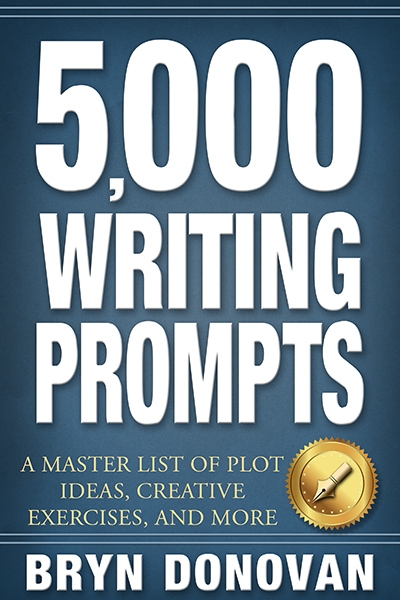
When I contracted the cover for my Master Lists for Writers book, I told the designer I wanted to be able to read the title from outer space. The cover really pops in a search of writing guides. You probably won’t do anything so extreme for your book, but you do want the title to show up.
2. There are too many layers of messages.
It’s fine to have one line that explains a book is part of a series. For instance, you could have:
ROLLING IN THE DEEP
A Mermaid Kingdom Novel
However, if you have more than one line explaining where it is in a series, like this:
A Mermaid Kingdom Novel
ROLLING IN THE DEEP
Book 1, the Golden Pearl Trilogy of Novellas
That’s probably too much going on.
There are a lot of extra phrases you can put on a book cover. A short quote from a reviewer, such as “Bryn Donovan is a master storyteller.” A tagline, like “She’s his worst enemy… and his only hope.” Don’t layer too many messages.
Make sure that taglines, quotes, and subtitles are small compared to your title and author name. Nothing else should compete with those two things. Advertising people call this “hierarchy of messaging.”
Don’t put a paragraph explaining what your book is about on the cover. That goes in the blurb, or on the back cover of a print version.
3. The fonts are gimmicky.
It’s totally understandable: a horror author finds a font made out of blood spatters, or someone writing a paranormal historical about Nikola Tesla discovers a font that looks like it’s made out of lightning, and they want to use it. Get a second opinion, at least. Novelty fonts can be difficult to read and can look amateurish.
4. The design doesn’t tell you what the genre is.
For instance, let’s say you have a romantic suspense novel that looks like this:

The sunny wheat field image does not scream “romantic suspense.” Even if the author puts this book in that category, people are going to be confused.
Shoppers only take a couple of seconds to decide whether they’re interested in a book. You want the cover to say to them, “Hey, here’s one of those books that you like.”
As an example: soon, I’m going to be contracting a cover for a paranormal romance. There’s a good chance that it’s going to have a shirtless man as part of the cover design. This isn’t because I love covers with shirtless men — I don’t have strong feelings either way — but because it’s a quick way to let potential readers know that it’s a steamy romance (the title, The Phoenix Codex, will tip them off that it’s paranormal.)
5. There are too many images.
Again, because shoppers are scrolling through thumbnails, simpler is often better. For a novice designer, incorporating several images can also be tricky.
6. The artwork or photography is stolen.
Whatever you do, don’t just grab an image from a Google search and use it for your cover. This is theft. You could get sued for a lot of money, and it’s terrible behavior. I’m sure you wouldn’t do this! But I had to mention it for other people reading this post.
Do you have some advice on designing book covers, or about other things to avoid? Please share them in the comments! (Do not link to bad examples, however!) Thanks for reading, and happy writing!


Consider this post as bookmarked. Great primer on titles and subtitles.
As for point (6): There are three options. Take your own photos, use public domain photos, or use Google Advanced Image Search. The last menu option is for photos that can be modified and used, even for commercial use. Just be sure to check to Creative Commons licensing.
Any indie-author who blogs should be well aware of these options as well.
Thanks, Erneso! I’ve been skittish about Creative Commons… I knew a website that got sued after using an image that they thought was Creative Commons. But I don’t know exactly what happened there, and it might have been the website’s mistake. I know a lot of people use those images with no trouble!
As a book cover designer, I spent a lot – a LOT – of time on CC0 sites. I have spent so much time looking for appropriate graphics that, way too often, I run across images that I know are stolen. Or, they will take an image (that I know is originally designed by a graphic artist I am familiar with) change it by the smallest amount of pixels, call it their own, and then upload to the CC0 site.
I used to wonder why they were doing this – apparently they get “tipped” often enough to make it at least a little bit profitable. Of course, the unsuspecting designer or writer sourcing from this CC0 site has no clue that the image they are downloading is at least 99% stolen, and they themselves could be in jeopardy.
Whenever I run across those images, I turn them in to the artist I know, just as a heads-up. What they do about it is entirely up to them, but I know what I would do if I were the original artist.
I hired a cover designer for the single title-sized books in my series, but I designed the first series novella myself. The big book has a color cover but for the novellas I wanted to distinguish them a bit from the big books (and save money) so I used a BW image from Shutterstock and used the same fonts the designer used for continuity. I totally agree with your assessments, Bryn, especially the fonts. There are a lot of great websites by cover designers to help with creating your own. One of them is by Derek Murphy, http://www.creativindiecovers.com. He has a few websites listed at the bottom of his website including one called DIY Book Covers. Thanks for the fab post, Bryn.
Hi, Artemis! Ooh, thanks for the link… that looks like a fantastic resource!
Great advice as usual.
Aw thanks Rachel — thanks for reading!
Another great post. Thank you.
For images, I’d like to add that you should not only make the image genre appropriate but also age appropriate. If you have written a book for adults, filled with crass language and violence, please, I beg you, don’t put a childish cartoon on front and say that because the dagger the character is holding is dripping with cartoon blood, people will know that it’s not a children’s book. Sorry, but they won’t.
The Sookie Stackhouse diaries fell into this trap with its original cover. It didn’t matter that the publisher specified the adult section; bookstore owners kept putting it in the children’s section because its cover resembled other children’s books. Finally, the publisher changed the cover, but still…
Oh, Judy, that is such a good point! I didn’t know that about the Sookie Stackhouse books. Holy smokes, that would be pretty inappropriate.
And it can be very tricky with stock photography, too, to signal YA vs. adult. You really have to be careful.
These are great tips. This past weekend, I attended a workshop about cover design, and I can add a few points here. When it comes to hiring an artist to design the cover, authors should understand the difference between licensing agreements and work-for-hire. Work-for-hire is the outright purchase of a piece of art, whereas licensing usually means you only own the image in the context of your book cover while the artist maintains the right to use the image in other contexts (the specifics are worked out in the contract). With work-for-hire, there’s usually a much higher upfront cost. You can expect to pay anywhere between 2-4 times what you’d pay for licensing the same image. Licensing typically works out best for everyone. I myself am an illustrator who paints covers for fantasy books, and I want to be able to sell prints of my paintings.
Hey, Ryan! Really good thing to bring up re: licensing versus work-for-hire. I’ve seen people license an image and then get mad when it shows up on someone else’s book cover as well, haha. Hey, could you please share a link to your website, if you have one? I’d love to see your work!
Well, typically, when you license an image for a book cover, the contract would state that it can’t be used for anyone else’s book cover. But that definitely needs to be addressed in the contract. You do often see the same image popping up on more than one cover, though, and that reminds me of another point. When you do a google search for an image, it’s best not to use any of the first images that pop up. Most likely they’re ranked high because other people are using them. This goes for me as an illustrator as well, when I’m looking for reference photos to paint from.
I designed my book cover myself. I used a website called adobe to buy my images. There are others like shutterstock as well which are useful. Then I used another website called Canva to do my final design.
Hi, Nicole! Congratulations on your book! I’m glad you mentioned Canva. I just love them… I use it for graphics on my blog and for graphics to share on Twitter. It’s a great resource.
Well done- great info. Loved seeing all the example covers- really fun and made it easy for me to learn more. Thanks!
The first three covers I made my self (I’m on Wattpad) and the newst one I decided to pay for and found a good artist on: fiverr- I did search around in amazon and I found the same elfin woman image in use inanoter cover, (Mines doing a different pose.) I’m not sure what to do abiut this, people like the cover, one friend is even using it for her phone lock screen. (O___O;) so um, I guess I’m going to have to use it xD It’s a nice cover I just with the cover artist would have tried harder at finding a more original picture. Oh well *shrugs* This will do until I save up my cash for an amazing cover. Anyway try out fiverr of you want a better then average cover but don’t have $80 to throw at a cover designer.
Hi Jessica! Yeah, it’s very common to see your same image out there on another book cover with stock images. This happens even with some traditional publishers, if it makes you feel any better! Thanks for commenting. 🙂
This often happens with composite images. While most terms of service do not allow the designer to take one stock image and use it alone, they are allowed to take this image and another one and creatively combine them. This is then considered a new work of art. Also, unless the designer buys an image outright, most likely they have licensed the use of the image as part of a design, and the license is non-exclusive. The only way to get around this is to spend more money. Often, a lot more money.
Hi, Georgene! This is really helpful, and I appreciate it! I get most of my images for the blog from a stock photo house, but I do also use photos from Pixabay. I do tip photographers often there, too, so I can see why people would do it. Is there any way for me to verify on Pixabay that the image isn’t stolen?
Sorry I forgot to check for typos, apologies.
Oh geez, no worries at all. 🙂
I used elements from three 19th-century public domain paintings for my latest book cover. It’s true that I’ve seen other paintings by one of the artists on a few traditional book covers in my genre. But I used less common paintings, so hopefully I won’t ever see it. But if that does happen, it’ll probably just make my book look less like it’s self-published. 😉
https://www.amazon.com/Atlantis-Tides-Destiny-Antediluvian-Chronicles/dp/1537417770/ref=sr_1_2?ie=UTF8&qid=1485449446&sr=8-2&keywords=atlantis+on+the+tides+of+destiny
Ooh, I never ever thought of doing that, Jennifer! And I’m glad you linked. That is GORGEOUS, and I’ve never seen that painting before. Very nice!
Thanks! 🙂 I’m quite proud of it!
Jennifer, both of your covers are beautiful. If I could again pass along some wisdom I picked up from that Book Cover Design Workshop I attended, I would say that the cover for On the Shores of Forever is the stronger of the two. The white text stands out better against the dark background on that one. Especially your name. Generally speaking, you want high contrast between text and background. For viewing on a screen, dark lettering on a light background is interpreted better by the eyes, and for print, white lettering on a dark background is interpreted better. But these “rules” aren’t as important as having high contrast overall, which is illustrated again in the case of your two covers here. The idea is to make your title as easy to see as possible. You could have gone even bigger with the “Atlantis” on that second cover for it to be even more visible on the tiny Amazon thumbnail.
Thanks a bunch for your advice Ryan! I plan to improve both of my covers for the second editions, and I’ll definitely keep your helpful feedback in mind. 🙂
I love all of your tips on cover design. Just reading the comments on using stock photos or even clip art. We were advised that if we use stock, to make sure the license allows alteration of the original. Then alter the original photo enough that it becomes your original. That will save some design time as well as to ensure that the design will not be seen on another book cover.
Kathleen, that is really interesting, thank you! As someone who isn’t a designer herself, I didn’t know about that.
Great advice, Bryn. And your good judgement shine through.